Meta Analysis on the GradStats App
26 Apr 2021A couple of months ago I realized a web app that lets people play around with historical graduate admissions data. Since then, thousands of people have used it and I took the liberty of tracking what people are searching for on the app.
Note: I don’t track your personal info, IP address, or anything. I only track what is being searched for and at what time.
I wrote about the app on this blog and posted a link to it on reddit. And so, by now, I think enough people have used the app that some trends will be noticeable. As I am not logging anything related to the users, this analysis is gonna be pretty limited, but it should still be fun.
What majors are more popular?
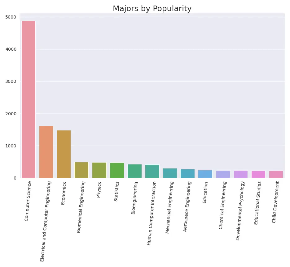
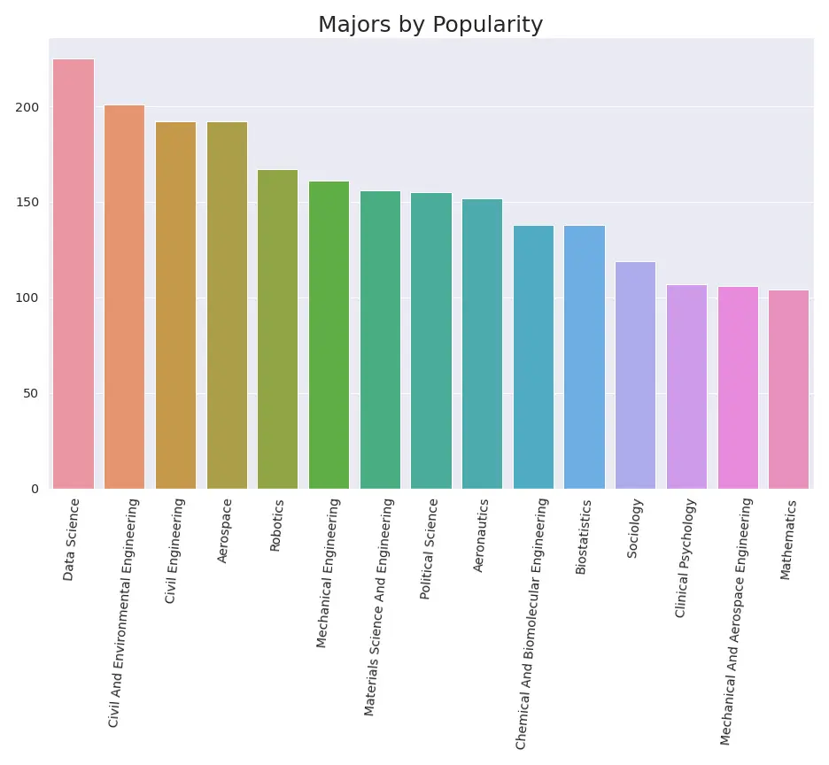
So, there’s a clear trend regarding CS and ECE as majors. The majority of users came to the app from reddit. I do wonder if that population is extremely biased to those majors and/or STEM in general. I will be sharing the app on Twitter and other platforms in hopes of diversifying the audience.
What degree are people shooting for?
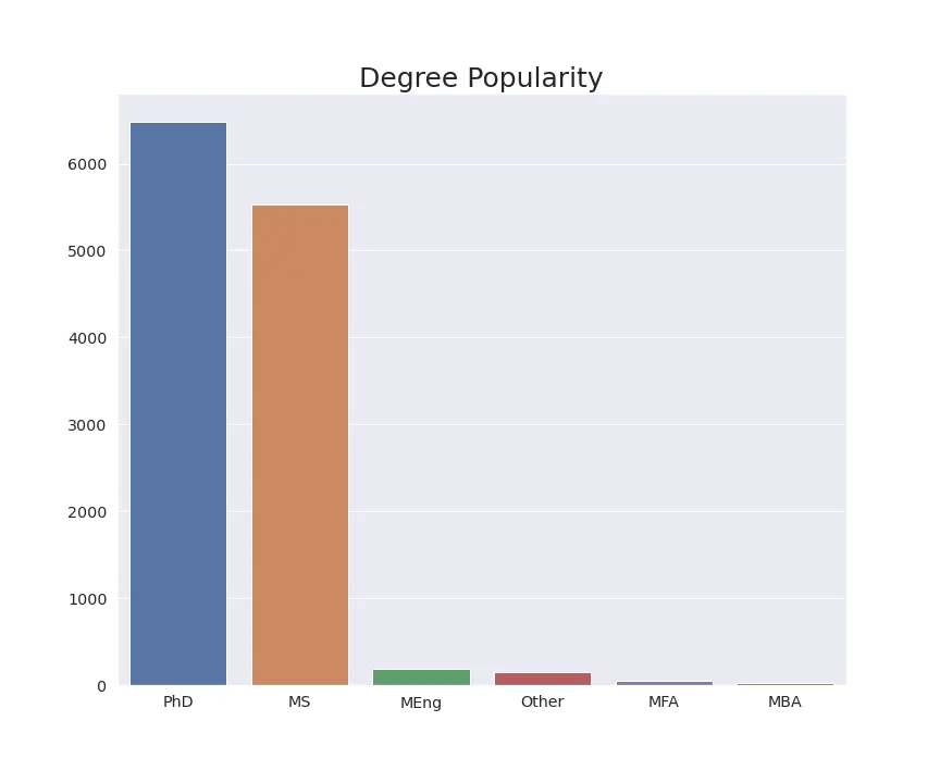
It seems like people are both shooting for PhD and MS degrees. MBA people don’t really seem to be too interested in finding out what the competition is doing. Then again, this could just be due to reddit’s biased population. GradCafe itself doesn’t have that many entries for MBA degrees, so it could just be that the sort of stats gathered on GradCafe aren’t too relevant for MBA applicants.
Where are people applying from?
As I mentioned in this post before, are I’m not tracking information on the users themselves. However, they are able to filter GradCafe entries by status, i.e. whether a student is American, International, etc.
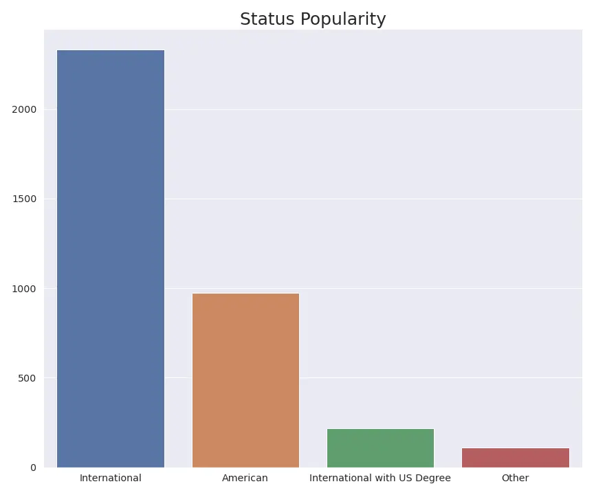
It seems like the app is particularly popular for people outside the US, specifically international applicants with degrees from outside the US.
As my initial analysis showed, this is probably not due to international applicants getting results later than American applicants.
What schools are more popular?
Making a plot for this would’ve probably been a lot tougher than for other aspects of the app. For this reason, I decided to simply create a word map that would representate how popular some schools are and what schools you guys are search for stats for.
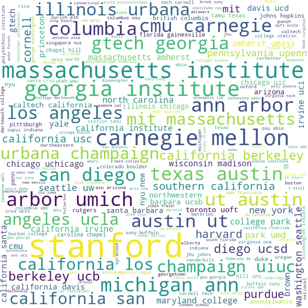
This could be because these schools are the most competitive and thus most people will consider them, take a look at the stats, and then decided whether to apply or not. It could also just be people checking what top universitiy stats look like. And it, of course, could be a combination of both reasons. Either way, these top schools are probably, once again, influenced by the bias in the population for this app.
A look into resources
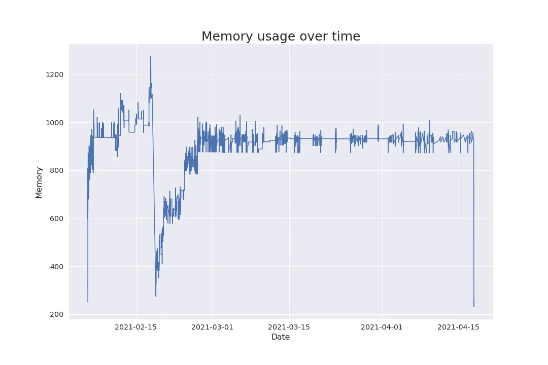
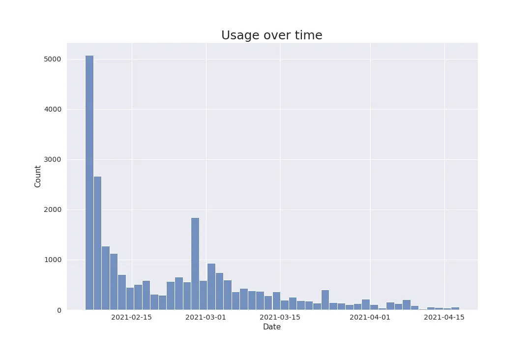
Usage has gone down as acceptances and rejects have gone out. That, and the fact that the effects from hitting the top of the subreddit are fading, makes it so the traffic for this app will be cyclical throughout each year.